Make more sales? Yes, please!
Increase conversion? Yeah, I don’t know maybe, what is it?
Are you seeing lots of people on your website, but no actual results? No one’s booking, no one is buying, everything just feels a little bit… dead?
The problem might be that your website isn’t converting.
What is “conversion”?
Conversion is used to show how many people turn into a client/subscriber/whatever. They “convert” from website visitor to paying client.
Let’s say you are rocking it on Instagram and you get 1000 people over to your website – well done you!
When those 1000 people land on your website, 100 of them buy something/sign up for your email list/book a discovery call (whatever it is you want them to do).
100/1000 = 0,1 = 10%
That’s your conversion rate. (And a damn good one as well!)
How do you find your conversion rate?
You need two things:
- The number of website visitors.
- The number of people that did-that-thing-you-wanted-them-to-do, in this case: Bought something of you.
Website visitors
To find out how many people visited your website within a certain time period you’ll need to log onto your Google Analytics. Set it to show “Last 30 days” and check the number under “Users”. There’s your website traffic.
Number of sales
Check your stats, files, accounts, wherever you keep a log of the number of sales.
If you want to see how many converts into your email list, log into your Email marketing service and look at the new signups for the last 30 days.
Calculate the rate
Number of sales / Number of website visitors
5 sales divided by 500 visitors = 1% conversion rate
How to increase your conversion
So now you know that conversion is how many of your visitors turn into clients and you know your own numbers. So how do we increase it?
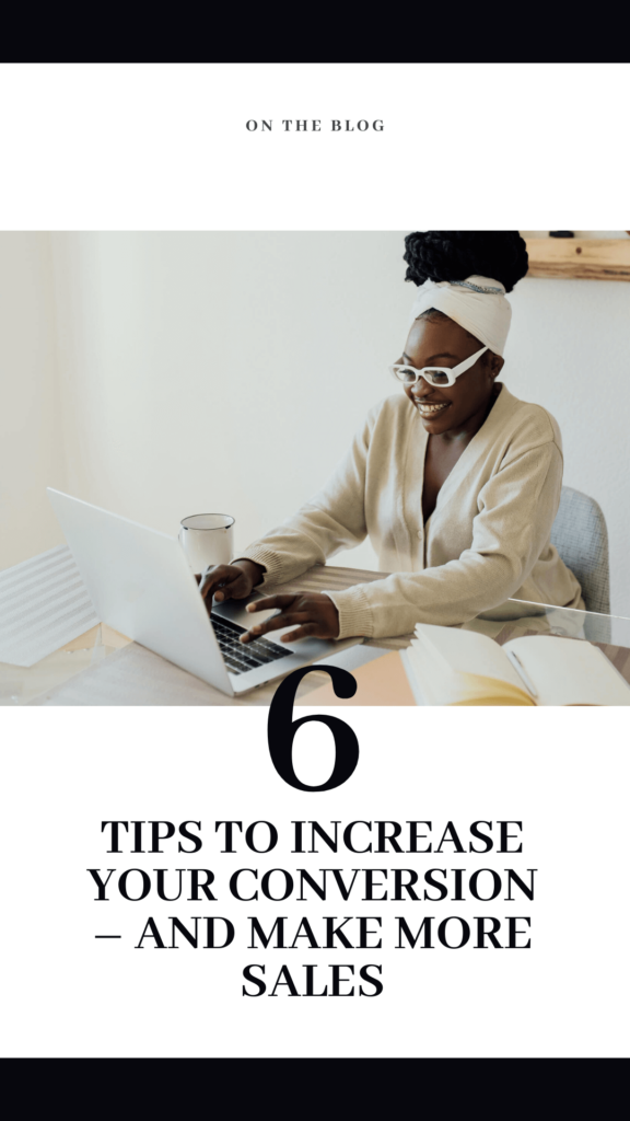
Here are 6 tips to increase conversion and make more sales on your website:
Align your website with your goal. If you want to increase sales of your group program then your website needs to show links and CTA’s to that where people will see them. Don’t just add it to your menu and hope people will click it. Add CTA’s on your blog posts, add CTA’s on your Homepage, About page and why not even on your Contact page?
Make sure your website works on mobile! This is incredibly important when your main marketing platform is Instagram, people are on their phones when they click over to your website! Text needs to be readable and not obscured by an image or on top of a busy image. Make your phone design separately so that everything works like it should.
Sprinkle CTA’s everywhere. Tell your visitor what you want them to do, also known as a “Call to action” section or button. On your homepage, push your new group program with a section and a “Apply here” or “Learn more” button. On your sales page, don’t be afraid to use the same CTA early on and lower on the page. If it’s a really long page, invite them to enrol or apply three times! You are probably the only one that reads all the words on the page, every one else will scan and needs to be reminded again and again to enrol.
Create an FAQ page. Stop being the bottle neck! When people are on your website, ready to buy/sign up to work with you they are inspired and on fire! They want to get it all done right there right now. But then they have a question. And they can’t find it on your website. So they have to email or DM you. And now the fire is slowly fizzling out. Create a FAQ page or section on your offers and keep them on your site and that fire burning.
Be consistent with the design. Studies show that a website that is poorly designed has less credibility amongst its visitors. Look at your own behaviour, if you would to go to a website to spend lots of money but the site looks mish-mashed and there is no consistency, on one page the buttons are yellow on the other they are green, what would you think? Stick to your brand, your colour palette, your typefaces and the design.
Optimise the Hero area. The hero area is the first top part of the website that someone sees when they go to your website. Your slogan, your happy face, who you help, how AND a Call to action. Simple, no fluff, but effective. I tweak my hero area every other week, yes I am a web designer and it’s what I do, but keep it up to date, keep it accurate and keep it amazing!
But what if…?
So now you know how to increase your conversion. More conversion, more sales.
But what if you also could increase your traffic? More traffic, more conversion?
How to increase your traffic
- Drive more traffic to your website (read more about that here!)
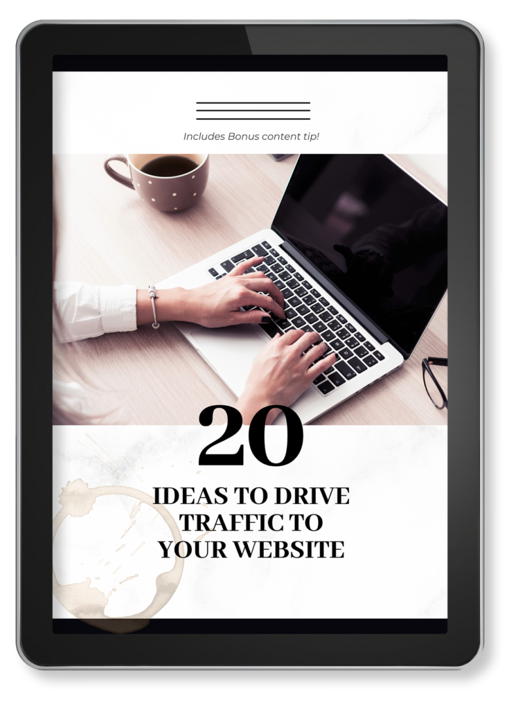
Don’t forget to grab your free guide to “20 ideas to drive traffic to your website” here!